Check out Part Three of my series of featured articles on The Profoto Blog! Catch up on Part One and Part Two.
Joe Morahan’s Colorful Splashes, Part III
Written by Fredrik Franzén on Thursday, September 26th, 2013. Original posted on The Profoto Blog.

Two weeks ago, we published the first part of the story of Joe Morahan’s colorful splashes, in which Joe talked about how the shoot came to be. Two days ago we published the second part, focusing on the actual lighting setup. This is the third and final part, in which Joe talk about the postproduction that went into the project. In Joe’s own words:
As any creative will tell you, you never really get over the rush of excitement seeing your vision realized. When I first closed my eyes and imagined this series, I wasn’t quite sure how I was going to pull it off. In the end it came down to luck — “when preparation meets opportunity.”
I’ve previously talked about how this body of work went from cool images floating around in my head to practical problem solving on-set. Now, I’m going to talk about the post-production and editing that gave my raw images that shot of adrenaline.
After several days of shooting, nearly a dozen models, thousands of water balloons, and buckets upon buckets of water on my studio floor, I was left with some really neat images. As a visual effects junkie, though, I always want to take my images to the next level. I’m not as interested in photojournalism or “straight” photography, as much as I am in telling a really dramatic and slightly surreal visual story. My favorite images always make me feel like I’m dreaming.
Although I love opening up Photoshop and having fun with my images, for this particular shoot I wanted a different look. I wasn’t sure quite yet what I wanted, so I turned to my know-it-all friend, the internet. Browsing around, I found the work of fellow sports photographer and Photoshop evil genius Kevin Conrad. He has a very slick editing style, and his skin tones and textures were out of this world. I had to hit him up, and see if he would collaborate with me on this project. He agreed, and the images turned out amazing!
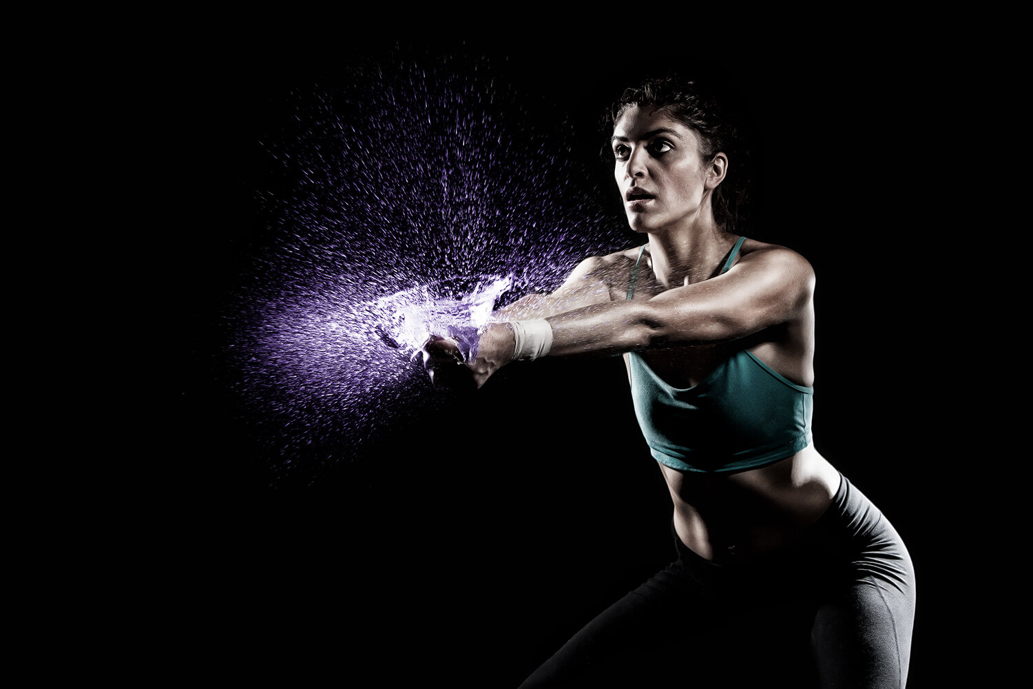
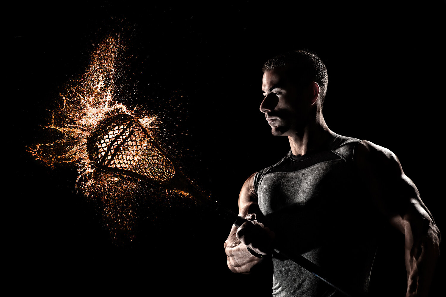
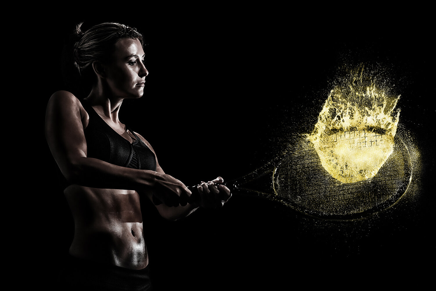
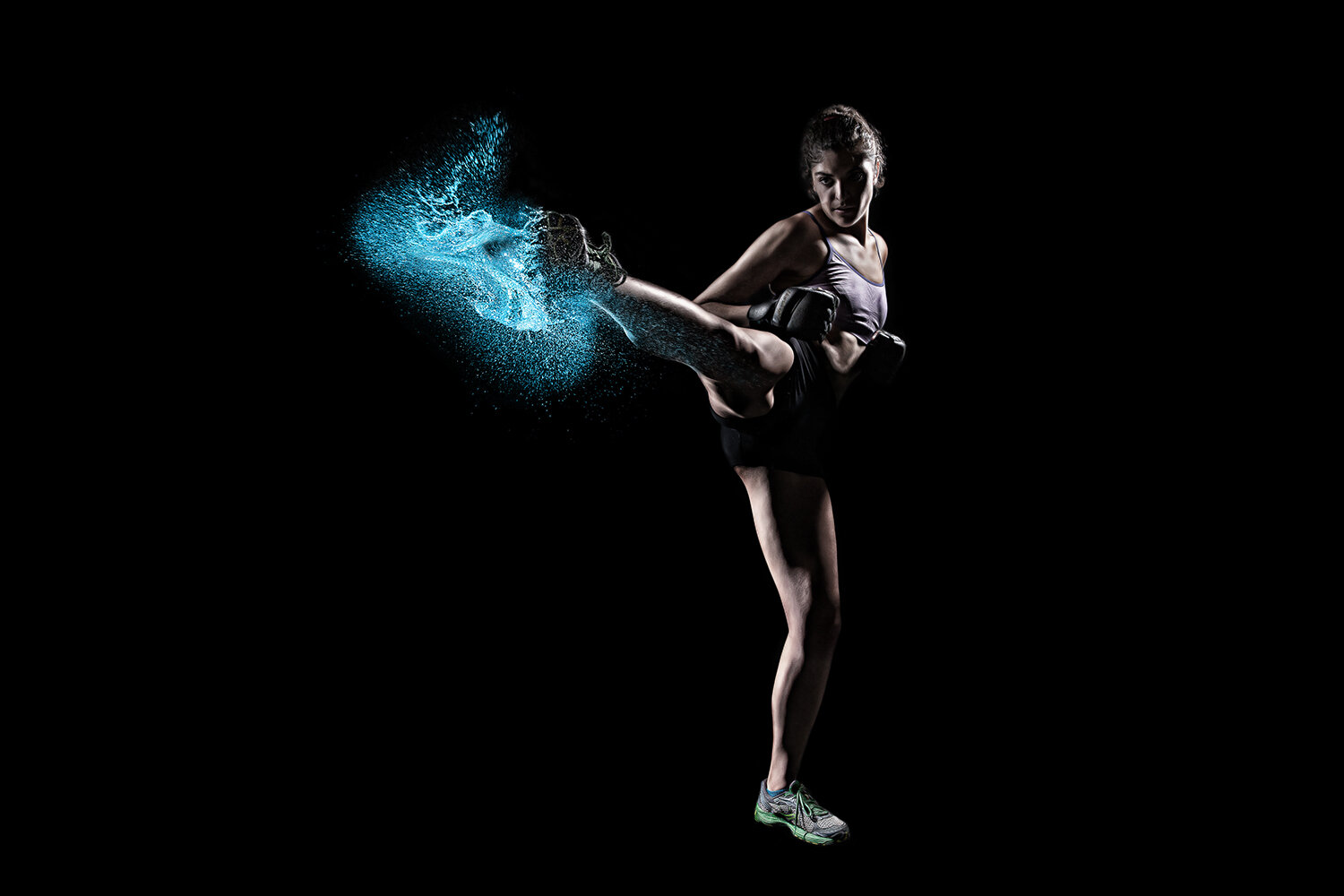
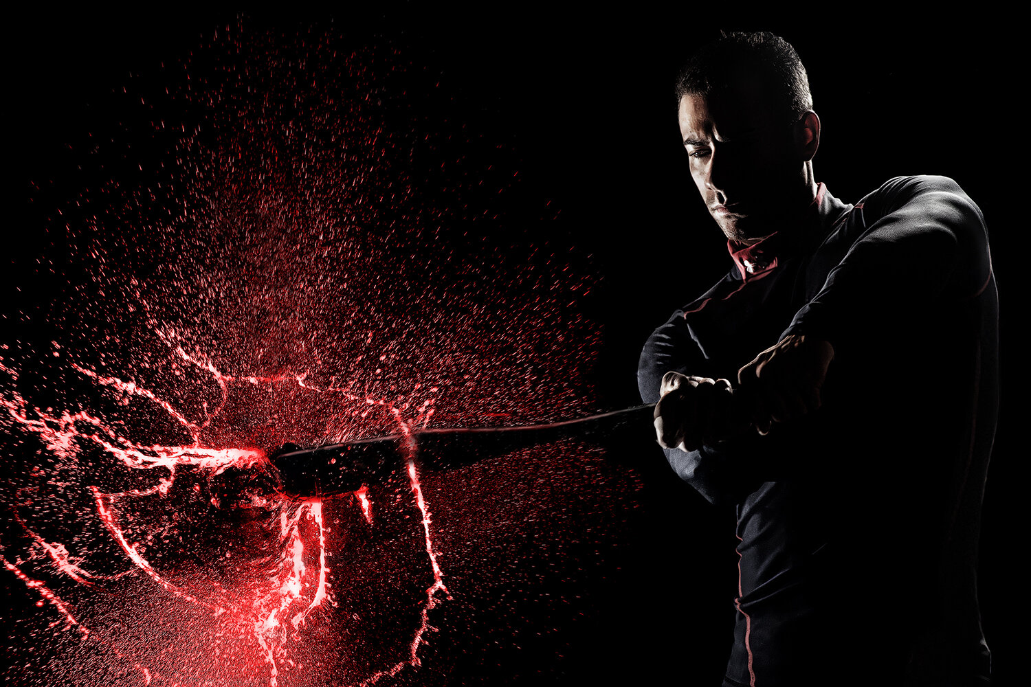
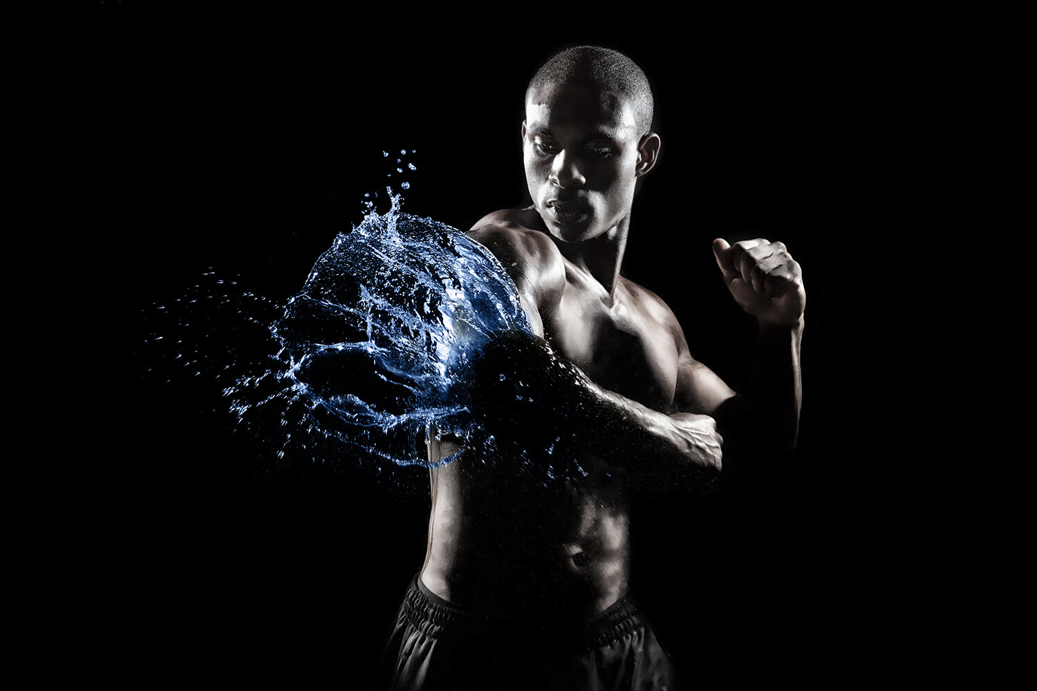
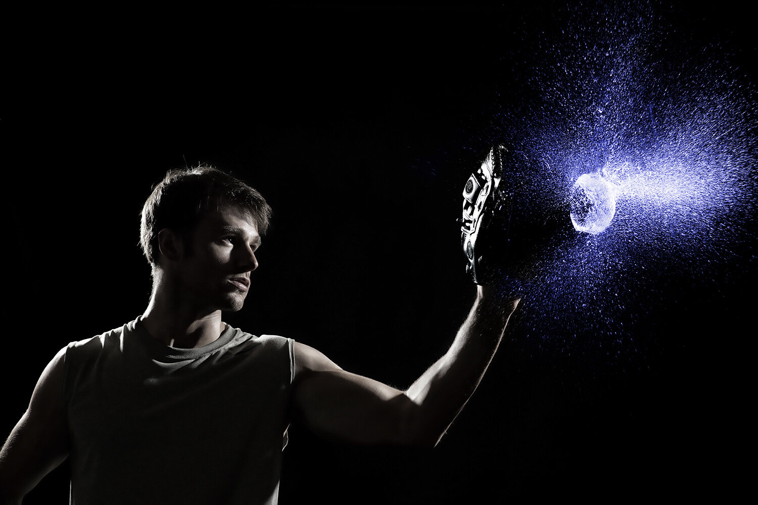
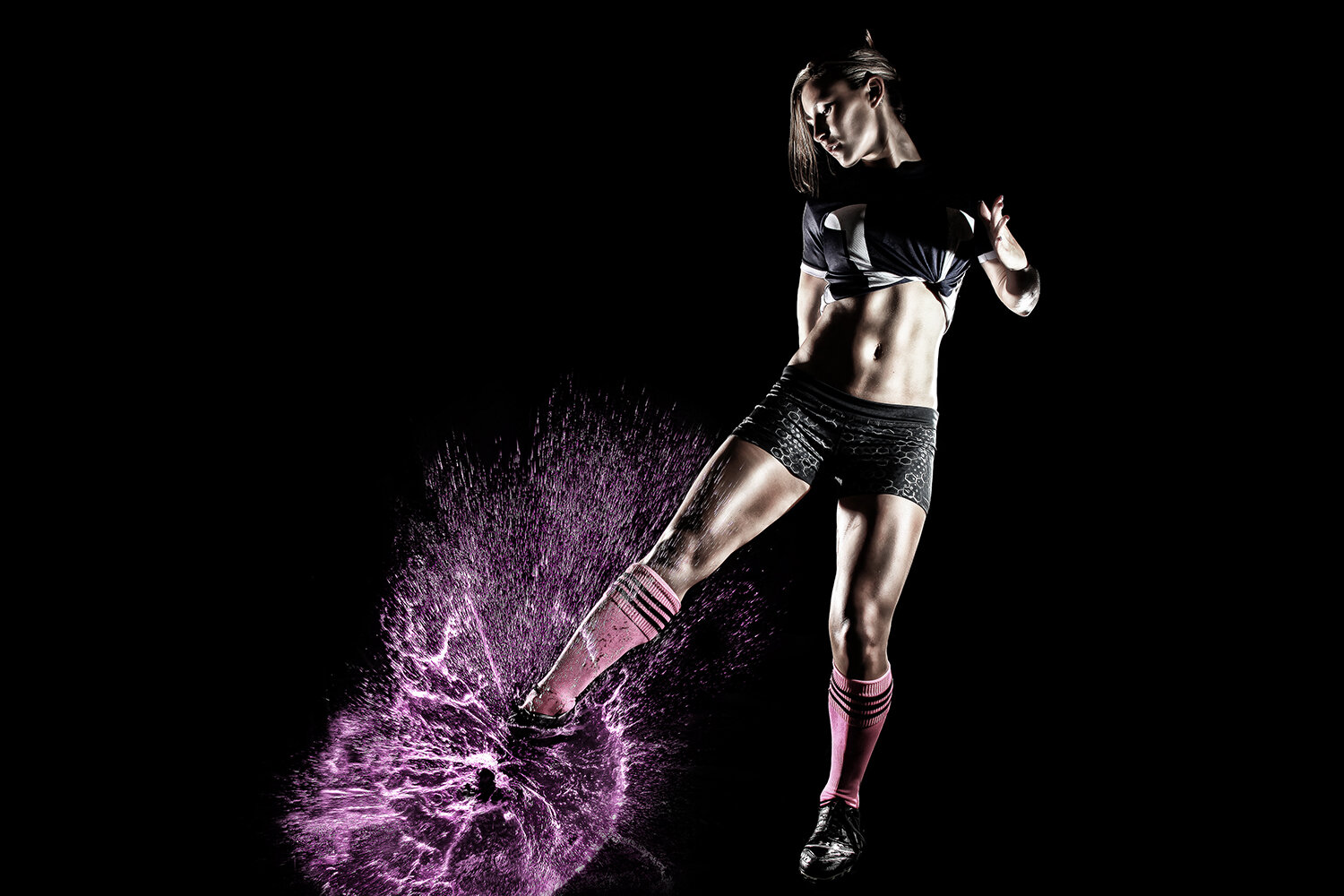
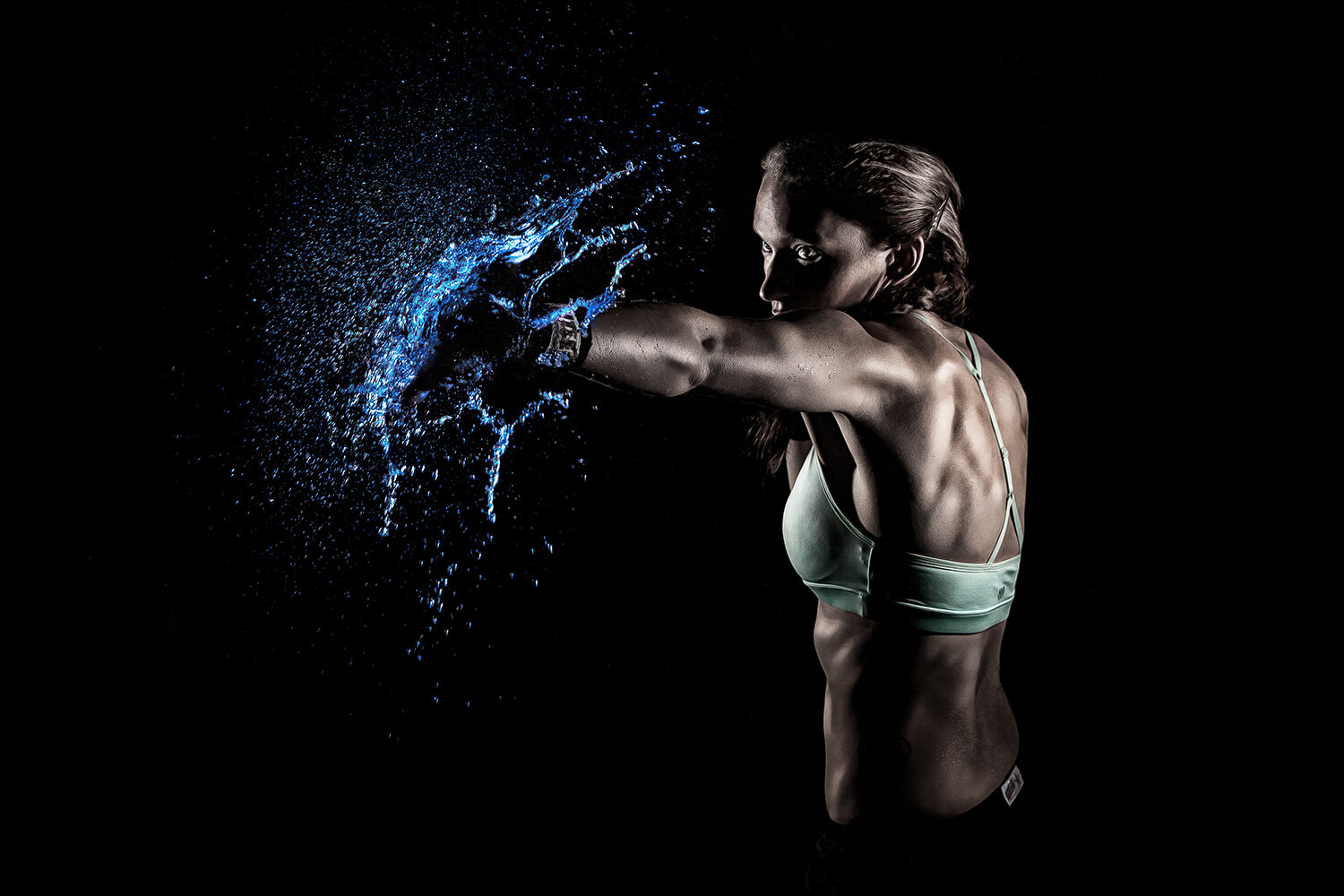
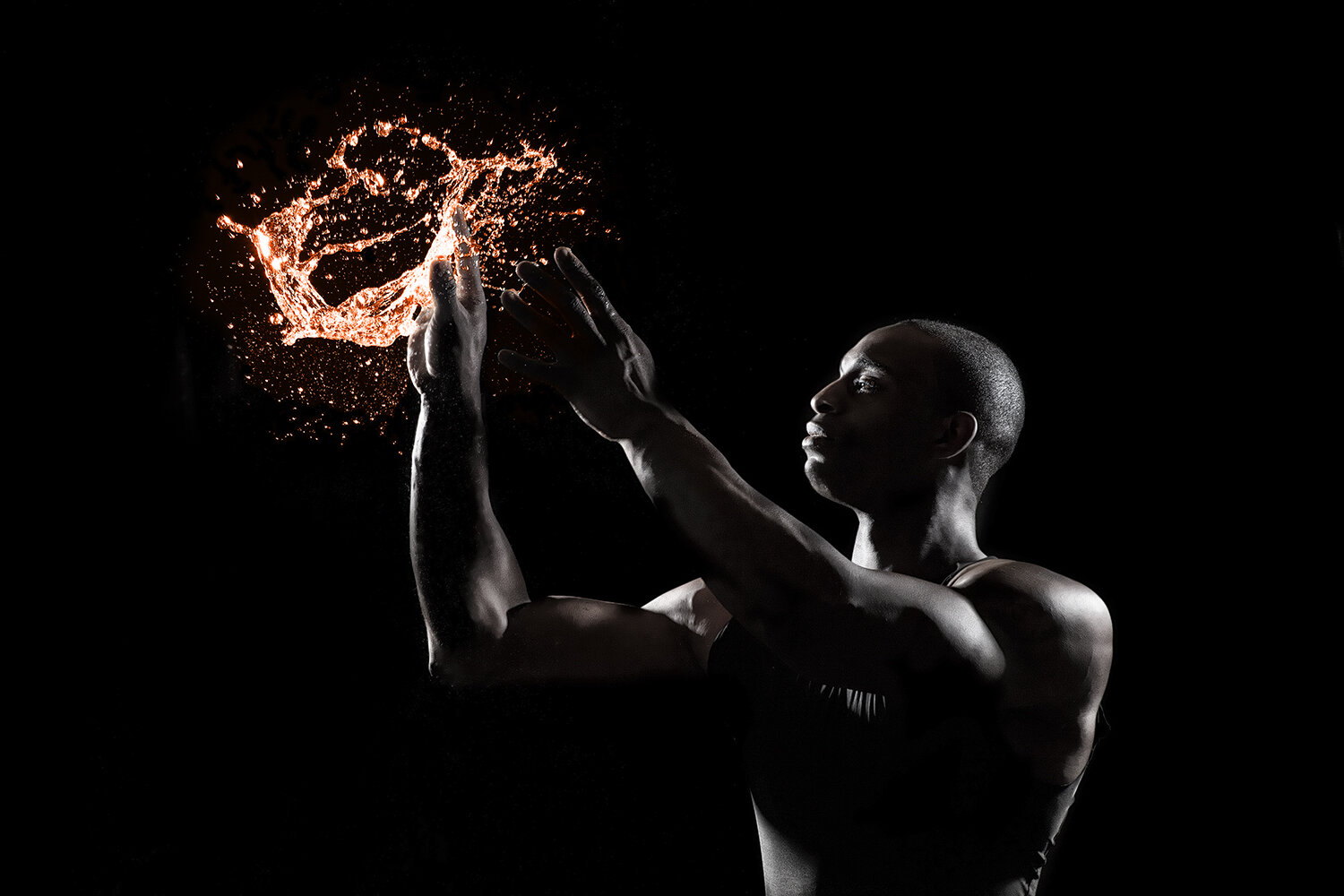
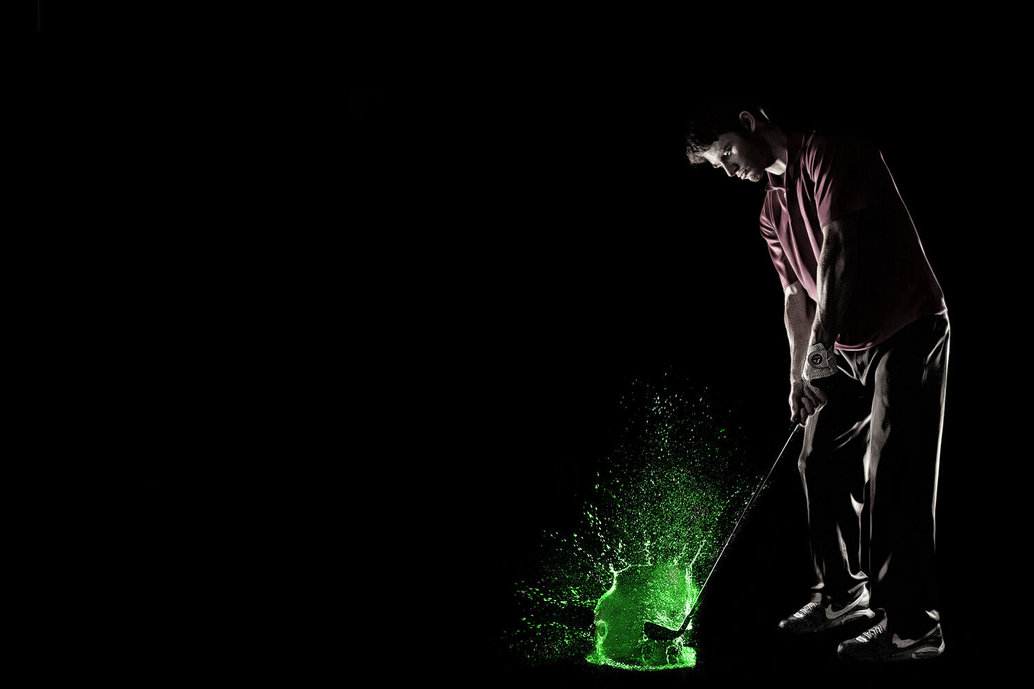
The trickiest part of editing was selecting the colors to use for the splashes. Because I’d envisioned this as an ad for a sports drink company, we had a lot of leeway in choosing wild and unnatural colors! Where possible, though, we tried to use a relevant color, like in the tennis image where the water matches the color of a tennis ball.
It was important to use different colors in each image, since the lighting was so similar and in some cases we used the same model for multiple sports. The unique colors really help each image stand out from the rest of the series.
Kevin’s editing really shines in these minimalist images. With pure black backgrounds, the eye is left to really focus on the athletes and the explosion of water droplets. To bring out the color of the water and prevent clashing with skin tones, Kevin desaturated everything but the splash. It also helped keep the images clean and really legible. I had a great time getting to know Kevin through this project, and look forward to our next collaboration!
Out of the group, my favorite images were the female MMA fighter kicking the water, and the baseball player hitting it out of the park. These images feel really dynamic and almost electric to me, and really capture the spirit of the series. To capture the roundness of the “baseball”, I took the shot about 50ms faster than some of the others, so the water didn’t have as much time to lose its shape once the surface of the water balloon was broken.
Looking back at the series — with all its challenges and triumphs — it was totally worth all those nights stocking coolers full of water balloons! The insanely muggy studio, though, I could do without. Maybe we’ll just shoot outdoors at night next time…